New museum building stone by stone
In Leiden, Happel Cornelisse Verhoeven Architecten restored and extended the museum building De Lakenhal and show that brick construction in the Netherlands has a tradition and a future; and that with very good craftsmanship and new techniques, the material offers new design possibilities.
The Netherlands is a country of rivers and clay soils. Clay is relatively easy and inexpensive to extract here and retains its quality even in extreme humidity. This topographical context has led to a rich brick tradition in which architects have applied the material over the centuries and helped shape the design of many Dutch cities. This is also true for the city of Leiden, where Museum De Lakenhal is located. The entire city centre consists almost entirely of brick facades, as does the museum ensemble itself. “It was an obvious decision (and challenge) for us to build on this tradition and create a logical bridge between old and new,” says Floris Cornelisse, architect and name partner of Happel Cornelisse Verhoeven Architecten, explaining one of the initial decisions.
The evolved ensemble
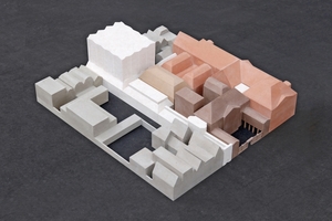
Originally, the Laecken Hall had served as a trading centre for fabrics and textiles since 1641. After this building was converted into a museum in 1874, the Laecken Hall/Museum was extended for the first time in 1890 to include the Harte¬velt Hall, before the Pape wings were added in 1922. The current last and third extension of the museum, the Van Steijn building, was intended to complete the museum and its growing collection of art objects with facilities that were still missing, such as a café, offices and a library. At the same time, the existing rooms and arrangements were to be more clearly structured for visitors and interwoven with the new building. Not only was the existing building restored, but a former atrium, for example, was converted into a connecting staircase.
The Achterplaats – behind the brick walls
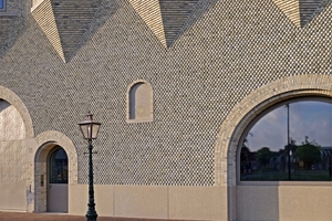
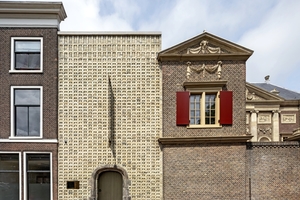
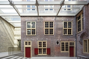
The most striking structural connection between the existing and new buildings is at the Achterplaats, the former inner courtyard of the merchant’s house from 1641. Here, old and new brickwork stand together. While the older buildings are clad in the reddish Bentheim sandstone, a brick was used for the new building that is produced by a firing process that can only be practised today: The so-called D190 brick is fired again in a second, low-oxygen firing process after the first firing. This decisive, technically newer firing process gives the brick its yellow-grey colour, which clearly stands out and yet matches the Bentheimer Standstein.
But it is not only the colouring of sandstone and brick that is different; the technical functions behind the bricks in the new building are also architecturally set according to the times: The light-coloured façade acts like an acoustic wall: special insulating material behind the brickwork, which is opened up by inconspicuous and regularly placed joints, regulates the room acoustics discreetly and effectively. In addition, the courtyard can be ventilated through the open joints between individual bricks, and the rainwater that falls from the courtyard’s new glass roofing is also drained behind the light-coloured brick wall.
Thirteen different shaped stones
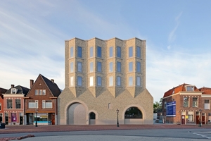
“On a brick wall you can recognise the mason’s craft.” Floris Cornelisse and his two office partners know about the traditional craft and found a brickyard with whose craftsmen they worked together to develop a formally new brick. “For the new façade on Lammermarkt, we wanted to achieve a soft façade relief, almost like a woven textile. For this we made special bricks that together form a shimmering surface.” This is how Floris Cornelisse explains the design approach for the façade. A total of thirteen different shaped stones were created using hand-moulding techniques. In a departure from normal rectangular bricks, these are always cut off at 30 degrees on one side, resulting in the shape of small houses with gabled roofs. In order to place all the bricks exactly on top of each other, wires were stretched vertically over the entire façade every 40 cm. “A disaster to build, but with a super result!”
The Lammermarkt is traditionally home to large textile factories, large brick buildings next to small weavers’ houses. This contrast was an important starting point for the new volume and was also determined by urban planning. The new façade on the Lammermarkt is structured by a delivery and staff entrance, the round-arched window of a museum room on the ground floor, and offices and studios above for the museum staff. In order to provide all offices with sufficient daylight, the building is tapered towards the top. The bay windows protrude in the brickwork between the plinth and the crown. This zigzag motif is derived from the gabled roofs of the surrounding weavers’ houses.
Brickwork continued in context
Whether you approach the museum building from the north via the Lammermarkt or from the south via the Oude Singel canal, you can see at first glance from the façades that the architects wanted to build on the architectural history of the museum and have realised this in a way that is worth seeing. Not to be forgotten is the decisive part played by the craftsmen who, working together, proved that working with bricks, building on a long tradition in this country, can still show new approaches. In this way, the historically existing structure can stand seamlessly side by side and together with today’s interpretation.

