Iconic design - Edersee visitor centre
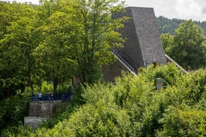
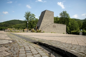
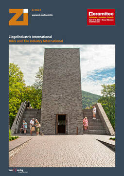
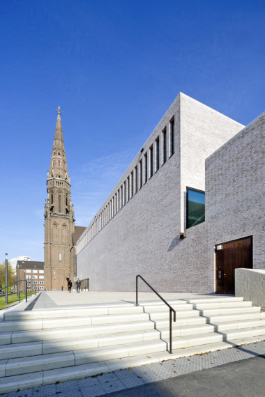
In an unusual place, a building also needs an unusual design. Following this guiding principle, a new visitor centre was built on the banks of Lake Edersee according to the plans of architect Christoph Hesse. The outer shape symbolises a cross-section of the neighbouring dam and, with the striking colour scheme of the façade, attracts attention from afar.
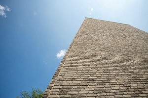
When Christoph Hesse from the office „ChristophHesseArchitekten“, founded in Korbach in 2010, was commissioned to build a new visitor centre at Lake Edersee a good three years ago, there was one key requirement from the conservation authorities: the colour of the façade material had to match the appearance of the masonry of the Eder dam as precisely as possible. From the outset, Christoph Hesse favoured a solid construction with hand-moulded facing bricks for the outer shell.
Contemporary infrastructure with a panoramic view
The entrance area is a highly visible feature of the new visitor centre, a stylised section of wall that appears to have grown out of the ground and houses a panoramic lounge next to the local tourist information office. From there, the view falls directly onto the dam and becomes a unique experience at the latest when the level of the lake rises above the maximum from time to time and the overflowing masses of water rush almost 50 metres into the depths. The „inner feeling“ begins to unfold with the stone-look materiality of the floors and walls and the view into the ten-metre-high tower, which is open at the top.
Colour scheme beyond all standards
Parallel to the extension of the underground parts of the building, Christoph Hesse dedicated himself to the search for a suitable facing brick for the façade cladding of the above-ground part of the building. However, no products available on the market were able to meet the colour specification stipulated by the conservation authorities. „The masonry of the dam is made of natural stone, which has a different visual effect to brick,“ explains Hesse. „In addition, wind and weather and water overflowing from the reservoir have affected the stones over time, resulting in a very difficult colour appearance on the surface that is beyond all standards.“ The conclusion: the façade cladding of the visitor centre requires facing bricks that obviously do not even exist. So Hesse turned to Vandersanden.
Special mixture of facing bricks
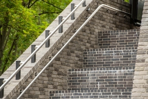
The search ultimately led to a specially composed architectural sorting consisting of three different brick types, christened „Melanchthon Mix Special“: 40 per cent each of Akita and Nevado Light facing bricks and 20 per cent of Nevado Dark.
Akita facing bricks are produced by Vandersanden from different types of Hohenbusch loam and are characterised by a subtle yet elegant grey-blue colour after treatment in the steaming oven. Loess clay varieties form the basis for Nevado Light and Nevado Dark, resulting in a nuanced interplay of grey, beige and black on the façade, complemented by brown in the darker version.
Clay pavers absorb the onslaught
The decision as to which material to use for the 420 square metres of exterior surfaces around the visitor centre was much easier than finding a façade with exactly the right colour. Christoph Hesse opted for paving bricks, which harmonise with the colour of the façade and blend in well with the overall appearance.

